
Case study, 2026 · Wix
Inna Zusman
A speed-first homepage rebuild for a bilingual cross-cultural therapist: one page that loads fast and turns hesitant visitors into consultations.
The brief
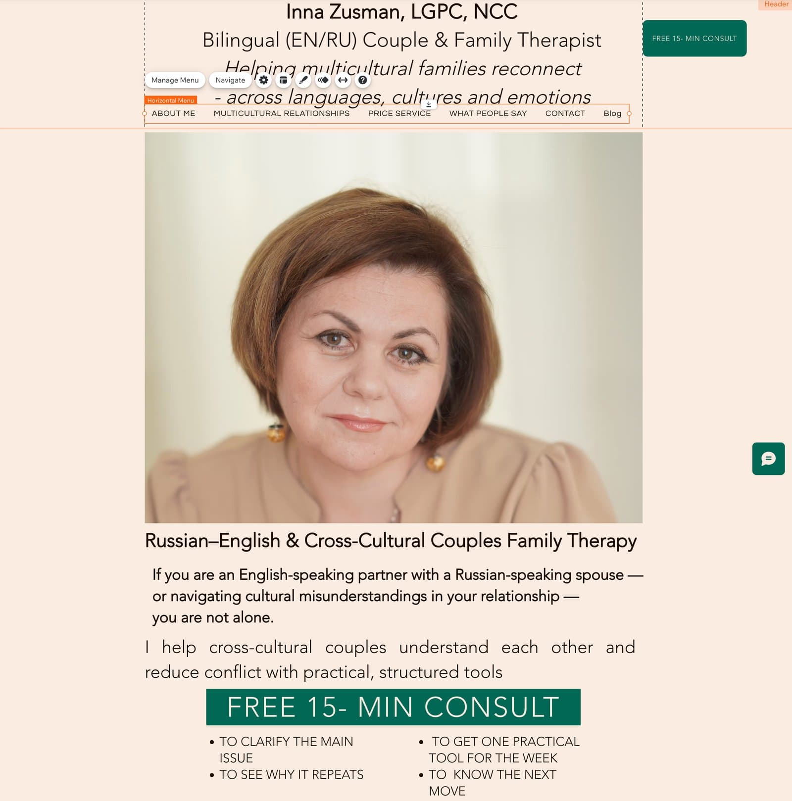
Her old homepage was an autobiography. One long About Me, a wall of specialties, an education history, and a booking button that handed visitors off to an external form. None of it was wrong; almost none of it answered the visitor's actual questions: who is this for, what happens next, and how do I start. For a therapist whose clients often arrive in a low moment, the page asked them to work for the answers.
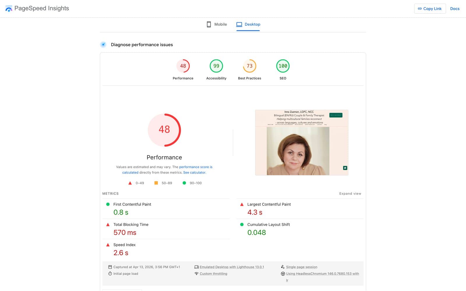
Speed was the quieter problem and the main point of the engagement. The old page's largest contentful paint took 4.3 seconds and the layout shifted while it loaded, so even a determined visitor waited before they could read a word. The brief was direct: rebuild the homepage so it loads fast, and use the speed to carry a hesitant visitor to a free 15-minute consultation.
What we did
Speed first, measured both ways
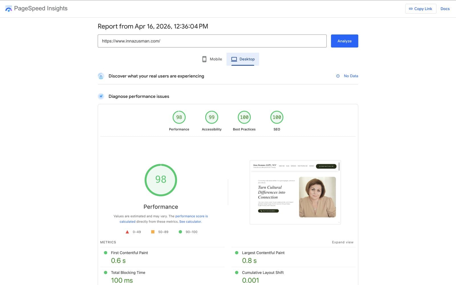
The rebuild was led by performance and verified in Google PageSpeed Insights before and after. Desktop performance went from 48 to 98: largest contentful paint dropped from 4.3 seconds to 0.8, total blocking time from 570 milliseconds to 100, and layout shift from 0.048 to 0.001. The point was not a vanity number. A fast page is the first act of care a therapist can offer a visitor who is already having a hard day.
From autobiography to front door
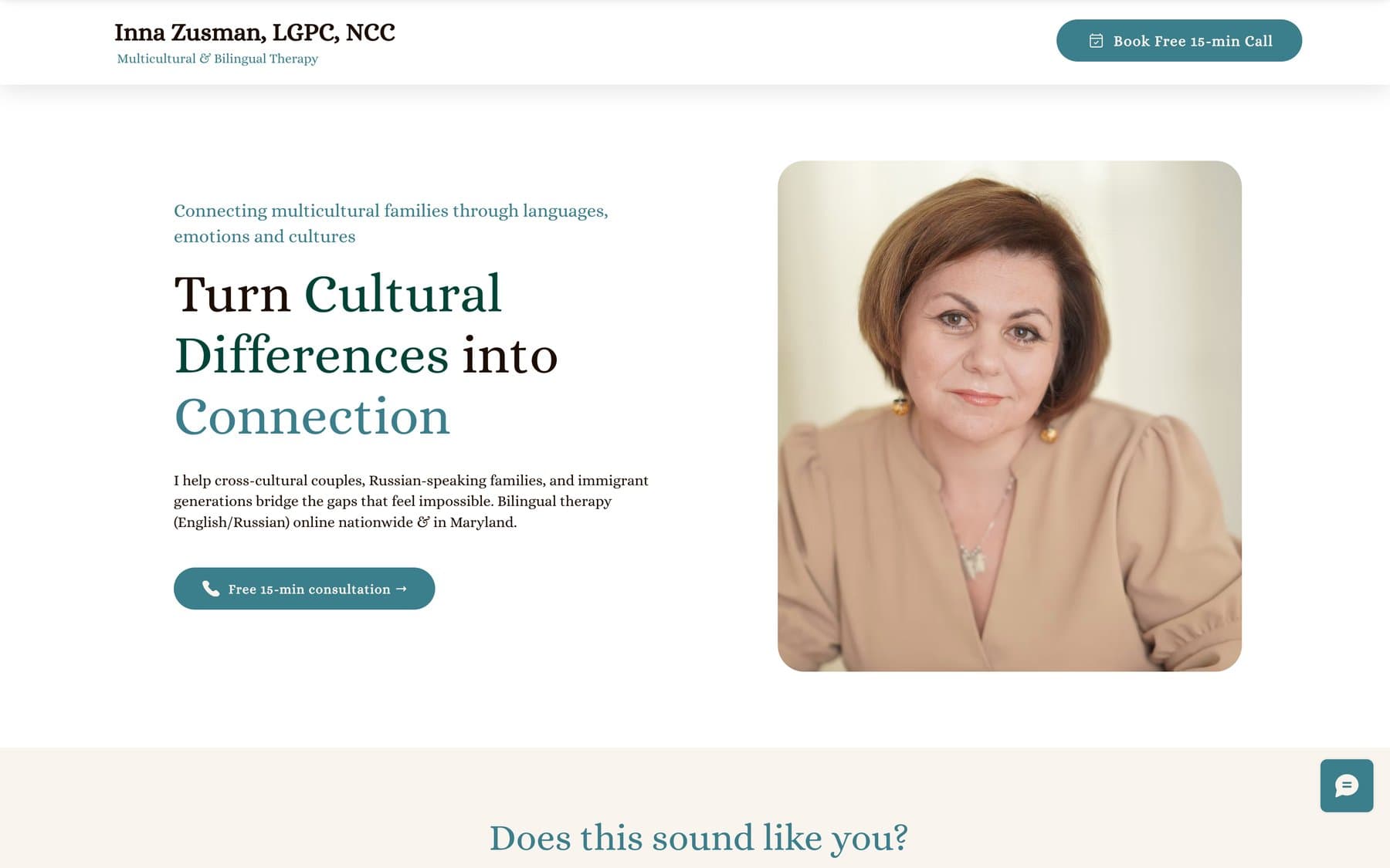
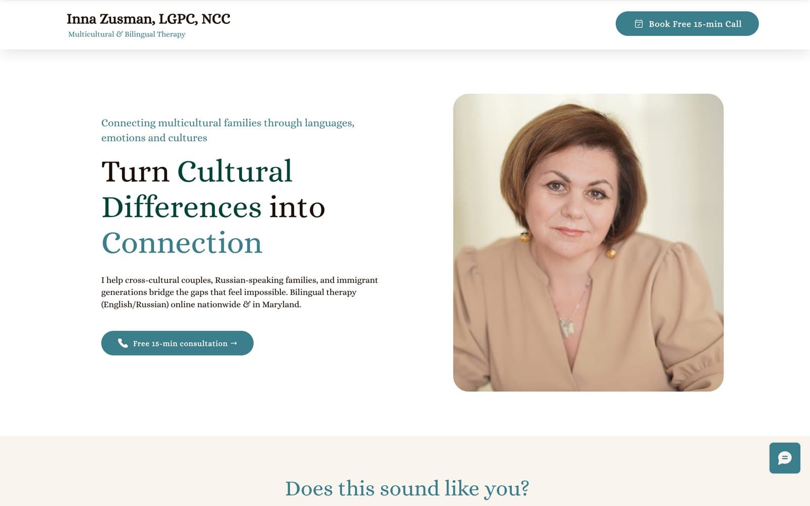
The new hero states the promise in one line, Turn Cultural Differences into Connection, and pairs it with the offer that lowers the stakes: a free 15-minute consultation. The old page opened with a biography; the new one opens with the visitor.
Three audiences, three doors
Cross-cultural couples, Russian-speaking couples and individuals, and adult children of immigrants each get their own door under the Choose what fits you list, with real Russian copy on the page rather than a translation afterthought. A visitor recognizes themselves in one glance instead of reading three paragraphs to find out whether they are the client.
The consultation path brought on-site
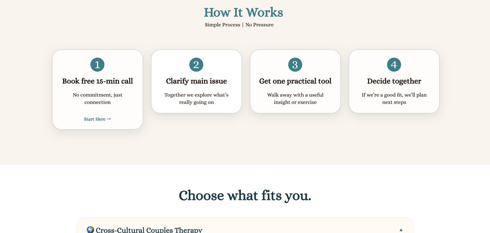
The old booking button handed people to an external form service. The rebuild moved booking onto the site itself: a four-step path that says exactly what the first call is, no commitment, clarify the issue, walk away with one practical tool, decide together, plus a message form in the footer for the ones who would rather write first. The page title changed too, from a string of credentials to a plain sentence about what she does and how to book it.
Proof and warmth, kept short
Credentials, approaches, and more than twenty years of experience are condensed into what a visitor needs to trust her. Fees sit in the open, client words sit beside them, and the page closes the way a first conversation should: no commitment, just a warm conversation.
The result
The desktop homepage now scores 98 in PageSpeed Insights where it used to sit at 48, and the visit ends at a consultation form instead of an autobiography. The scope was one page, and one page was enough: everything a new client needs to decide, from who this is for to what the first call costs, now sits on a homepage that loads before doubt does.